
[dutch]
Toen ik afgelopen maandag deze outfit postte kreeg ik daar heel veel leuke reacties op, maar ook heel vaak de vraag hoe ik toch dat dromerige effect erover heb gekregen. Daarom leek het me een leuk idee om jullie vandaag in Blog Bizz uit te leggen hoe je je foto’s zo bewerkt als ik hier heb gedaan. In bovenstaande foto zie je links het origineel en rechts de bewerkte versie. Hieronder laat ik je zien hoe je deze bewerking in 13 stappen met behulp van Adobe Photoshop CS6 uitvoert. Nu is het natuurlijk niet zo dat precies deze bewerking voor elke foto werkt, maar je zou het als leidraad kunnen gebruiken. Succes!
Liefs,
Rowan
Ps: Heb jij je al geabonneerd op de RED REIDING HOOD ‘catch up’ nieuwsbrief? Nee? Geef je dan snel hier op! De volgende editie wordt deze zondag verzonden.
[english]
When I posted this outfit last Monday I got many great comments of you, but many of you also asked me how I achieved this dreamy effect. That’s why I thought it would be a fun idea to explain you in Blog Bizz today how you edit your photos like I did. In the photo on top you see the original on the left and the edited on the right. Underneath I show you how to do this editing in 13 steps using Adobe Photoshop CS6. Of course this exact same editing won’t work for every photo, but you could use it as a guidance. Good luck!
Lots of love,
Rowan
Ps: Did you already sign up for the RED REIDING HOOD ‘catch up’ newsletter? No? Sign up here! The next edition will be sent this Sunday.

STAP 1: Klik rechts onderin op het vierde icoontje (rood omcirkeld) en kies in de lijst voor ‘Curven’. Pas vervolgens apart de kleuren ‘rood’, ‘groen’ en ‘blauw’ lichtelijk aan totdat je foto de kleur heeft die je wil. In het screenshot hierboven kan je zien hoe ik de verschillende kleuren heb aangepast.
STEP 1: Click right under on the fourth icon (in a red circle) and pick ‘Curves’ from the list. Adjust the colors ‘red’, ‘green’ and ‘blue’ until the photo has the color you want. In the screenshot above you can see how I adjusted the different colors.

STAP 2: Klik wederom rechts onderin op het vierde icoontje, maar kies nu voor ‘Verloop toewijzen’. Dubbel klik nu op de balk met het kleurverloop en een nieuw scherm verschijnt waarin je de kleuren aan kan passen. Dubbel klik nu eerst op het rood omcirkelde icoontje links en voer de kleurcode ‘0a2059’ in. Dubbel klik nu op het rood omcirkelde icoontje rechts en voer de kleurcode ‘faa538’ in. Kies nu in het groen omcirkelde menu voor ‘Fel licht’ en verminder de dekking (blauw omcirkeld) tot 11%.
STEP 2: Click again on the fourth icon right under, but now pick ‘Gradient map’. Double click on the bar with the gradient and a new screen where you can adjust the colors pops up. Now first double click the icon in the red circle on the left and enter color code ‘0a2059’. Now click on the icon in the red circle on the right and enter color code ‘faa538’. Now pick in the menu in the green circle for ‘Hard light’ and reduce the opacity to 11%.

STAP 3: Klik met je rechter muisknop op de laag die je net hebt gecreëerd en kies voor ‘laag dupliceren’. Je hebt zojuist een kopie gemaakt van je vorige laag. Kies nu in het groen omcirkelde menu voor ‘kleur tegenhouden’ and kies voor een ‘dekking’ van 20%.
STEP 3: Right click on the layer you just created and choose ‘duplicate layer’. You just made a copy of your previous layer. Choose in the menu in the green circle for ‘screen’ and choose an ‘opacity’ of 20%.
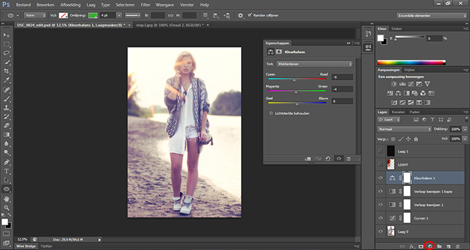
STAP 4: Klik op het rood omcirkelde vierde icoontje rechts onderin en kies ‘kleurbalans’. Vul nu bij cyaan-rood ‘-9’ in, bij magenta-groen ‘-4’ en geel-blauw ‘0’. Zorg ervoor dat je het vakje ‘lichtsterkte behouden’ NIET hebt aangevinkt.
STEP 4: Click the fourth icon in the red circle right under and pick ‘color balance’. Now enter at cyan-red ‘-9’, at magenta-green ‘-4’ and at yellow-blue ‘0’. Make sure you unbox ‘preserve luminosity’.

STAP 5: Voeg een nieuwe ‘laag’ toe door op het zesde rood omcirkelde icoontje rechts onder te klikken. Kies in het groen omcirkelde menu voor ‘bleken’. Kies ‘penseel’ in je lijst met gereedschappen (linker zijbalk) en kies voor een ‘grootte’ (bruin omcirkeld) van ongeveer 1000 pixels en zet de ‘hardheid’ (bruin omcirkeld) op 0%. Zet zowel de dekking als de stroming (blauw omcirkeld) op 100%.
STEP 5: Add a new ‘layer’ by clicking the sixth icon in the red circle right under. Choose for ‘screen’ in the menu in the green circle. Pick the ‘brush’ in your list of tools (left sidebar) and pick a ‘size (in the brown circle) of approximately 100% pixels and set ‘hardness’ (in the brown circle) to 0%. Set both ‘opacity’ and ‘flow’ (in the blue circles) to 100%.
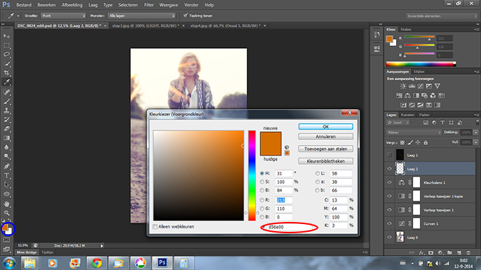
STAP 6: Verander de kleur van je penseel door te klikken op het blauw omcirkelde icoontje en vervolgens de kleurcode ‘d56e00’ in te voeren.
STEP 6: Change the color of your brush by clicking the icon in the blue circle and enter the color code ‘d56e00’.
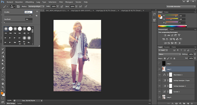
STAP 7: Gebruik het penseel dat je zojuist hebt gecreëerd om meer licht te vormen. Laat een beetje meer licht op het lichaam en op het strand vallen.
STEP 7: Use the brush you just created to form more light. Add some more light on the body and on the beach.
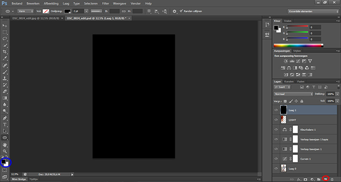
STAP 8: Voeg een nieuwe laag toe door op het rood omcirkelde icoontje te drukken. Kies de kleur zwart in het blauw omcirkelde icoontje en druk vervolgens op alt+backspace om je nieuwe laag zwart te maken.
STEP 8: Add a new layer by clicking the icon in the red circle. Pick the color black in the icon in the blue circle and press alt+backspace to make the new layer black.
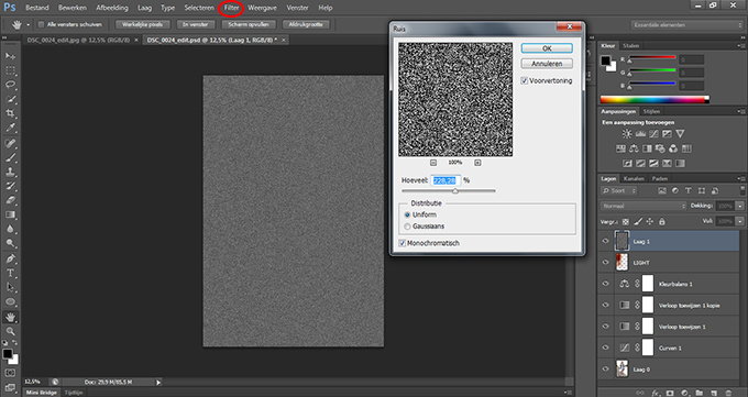
STAP 9: Kies in het rood omcirkelde tabblad ‘filter’ voor ruis en zet de hoeveelheid op ongeveer 230%, zet de distributie op ‘uniform’ en vink het vakje ‘monochromatisch’ aan.
STEP 9: Click the tab page ‘filter’ in the red circle and choose ‘noise’. Set the amount to approximately 230%, set the distribution to ‘uniform’ and check the ‘monochromatic’ box.
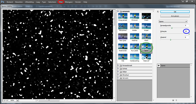
STAP 10: Kies in het rood omcirkelde tabblad ‘filter’ voor ‘filtergalerie’. Kies dan in de map ‘Artistiek’ voor ‘Spons’. Zorg ervoor dat de scherpte op maximaal, 25, staat. Voor penseelgrootte koos ik 4 en voor vloeiend koos ik 6, maar andere getallen doen het ook prima.
STEP 10: Choose in the tab page in the red circle for ‘filter gallery’. Choose in the folder ‘Artistic’ for ‘Sponge’. Make sure the definition is set to the max, 25. For brush size I picked 4 and for smoothness I picked 6, but other numbers will work just fine as well.

STAP 11: Voeg een nieuwe ‘effect laag’ toe door op het rood omcirkelde icoontje te drukken. Kies nu in de map ‘Schets’ voor ‘Stempel’. Bepaal nu door met de getallen van ‘balans licht-donker’ en ‘vloeiend’ te spelen hoeveel vuurvliegjes je wil (dat is wat we nu aan het maken zijn). Ik koos voor de getallen ’26’ en ’17’.
STEP 11: Add a new ‘effect layer’ by clicking the icon in the red circle. Now choose in the folder ‘Sketch’ for ‘Stamp’. Now decide by playing around with the numbers of ‘Light/Dark balance’ and ‘Smootheness’ how many fireflies you want (that’s what we’re creating now). I picked the numbers ’26’ and ’17’.

STAP 12: Klik weer op het rood omcirkelde tabblad ‘filter’ en kies voor ‘vervagen’ en vervolgens voor ‘gausiaans vervagen’. Kies een laag getal zoals ‘6’.
STEP 12: Click the tab page ‘filter’ in the red circle again en choose ‘blur’ and then ‘gaussian blur’. Pick a low number like ‘6’.

STAP 13: Klik op CTRL+U en er verschijnt een kleurtoon/verzadiging scherm. We gaan nu de vuurvliegjes een wat realistischere kleur geven in plaats van spierwit. Vink het vakje ‘vullen met kleur’ aan en vul de volgende nummers in: kleurtoon ’27’, verzadiging ’61’ en hardheid ‘0’.
STEP 13: Click CTRL+U and a hue/saturation screen will appear. We’re now going to give the fireflies a more realistic color in stead of white. Check the box ‘colorize’ and add the following numbers: hue ’27’, saturation ’61’ and lightness ‘0’.


6 comments